Digging Deeper into Onondaga Lake
Apparently, there is a large lake in Syracuse NY, but I didn’t see it until recently. Onondaga Lake is hidden by the flat geography and Carousel Mall. Hearsay of the lake’s pollution fuels the mystery. Now I’m at the DS Institute working on the limnological study. We went to the twelfth annual Onondaga Lake Scientific Forum a few days ago. The day-long conference included many presentations by scientists and contractors hired to work the lake. We found out that most of the work is on analyzing and modeling the lake system, and not remediation.

Before going to the conference, I perused the history of this Superfund site. To summarize:
- Syracuse dumped raw sewage into the lake for years, resulting in phosphorus, ammonia, nitrite, bacteria, and other harmful microorganisms choking off the lake’s life.
- Millions of gallons a day of chloride, sodium, and calcium were dumped into the lake since 1884 until the Clean Water Act closed Honewell’s soda ash plant in the 1970s.
- Honeywell dumped mercury, a byproduct of chlorine production, right into the lake, maxing out at 22 pounds of mercury per day (82 tons total), between the 1950s and ’70s *.
- Other companies dumped PCBs into the lake.
- The lake is still the geographic drainage basin for Onondaga County accepting unfortunate runoff from the neighboring Solvay Paperboard plant and others.
- Fishing for food has been banned for decades, but fish diversity is slowly growing and bird presence is increasing, despite heavy pollution (video of Bald Eagles on the lake here).
At the conference, I learned that:
- The lake is a complex ecosystem. Alewife (fish), Daphnia (tiny crustaceans), and Zooplankton (microorganisms) feed off of each other producing perennial boom and bust cycles/feed-back loops.
- The lake is still a source of pollution because even waves caused by wind can stir up the toxic sediment into the water.
- Many scientists (teams from Michigan U, Cornell, etc) and contractors (Metro and Marcellus Sewage treaters) work on the lake and tributaries.
- The funding for this work comes from the Upstate Freshwater Institute, Syracuse Center for Excellence, and the 475 million dollar fund from Honeywell.
- The majority of these people are focussed on analysis, not remediation. The few that do focus on rehabilitation (not remediation either) are the sewage processing plants. They focus on making sure their effluent is getting more clean (limiting phosphorus and etc).
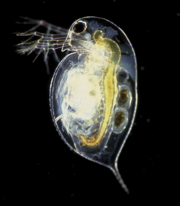
- Daphnia look beautiful – even chimerically mythical – under a microscope (photo below)!
The conference did not seem to address:
- The need for improved knowledge sharing between parties. Most groups are working out their own particle tracking models, while some are still messing with dumping dies into the lake and studying their movements.
- The current debate between Honeywell and others about how deeply to dredge the bottom of the lake.
- The complexity of the pending plan of pumping out lake water, sending it for processing, and returning it back into the lake.
- The critical need for public debate about what the lake should become so as to inform future action.
The talks were very informative. The visualisations were stellar. One group discussed the life and death cycles of the iconic Daphnia, a crustacean that can easily swim far up your nose. Another group described their algorithms that find correlations between sunlight absorption of the lake and different contents of substances such as phosphorous, benzene, and chlorophyll. Soon, they said, they wouldn’t have to send scientists to sample any more lake water because their models would be able to figure it all out from a satellite photo.
The conference was at the movie theater and was well orchestrated. The lunch in the theater’s banquet area was delicious. The coffee was good and strong, and held up for the day. The attendees were very optimistic. $25 dollars well spent!
Star Wars: Most Boring VS Most Surprising Moments

The x (horizontal) axis is time. Time is skewed to show relative time spent processing summary image candidates for each part of the trilogy. Two summary frames are shown representing the most boring and the most exciting sections. The thin purple vertical lines are most surprising frames kept for the final 40 image summary.
Previously, I showed computer generated summaries of the Star Wars Trilogy. Using data from the last session (40 image summary) I created an info graphic to represent the most boring and the most surprising patches in the Trilogy.
As the software churned on these films, it kept choosing summary images while updating its vocabulary file (used for comparison of the images). In the process, some of these initially picked images were discarded to make room for even more surprising images in the final set of 40. At the end, we ended up with the 40 most surprising images.
Surprise score of an image already in the summary is defined as its distance from other images in the summary. We can define the threshold for picking an image as either the minimum summary score, or the mean summary score.
– Yogesh Girdhar
Some other ways to describe the rules of surprise are:
- Our final kept set of stills are most unlike all other chosen candidate stills.
- We pick the most common and the most rare stills.
- We pick stills such that if we view the picked stills, we won’t be surprised by any of the other stills.
At the end of the 40 image summary run, I had enough data to ballpark where most of the initially picked candidate images came from and also which of them made it into the final summary. In general, it seems that Empire Strikes back Darth Vader fighting scenes are the most surprising to the software, while the first movie contains the least noteworthy patch. This least significant boring section is mostly the middle section of the first movie: robots wandering around in the desert.
Stare Wars: Using the Force (of Surveillance)
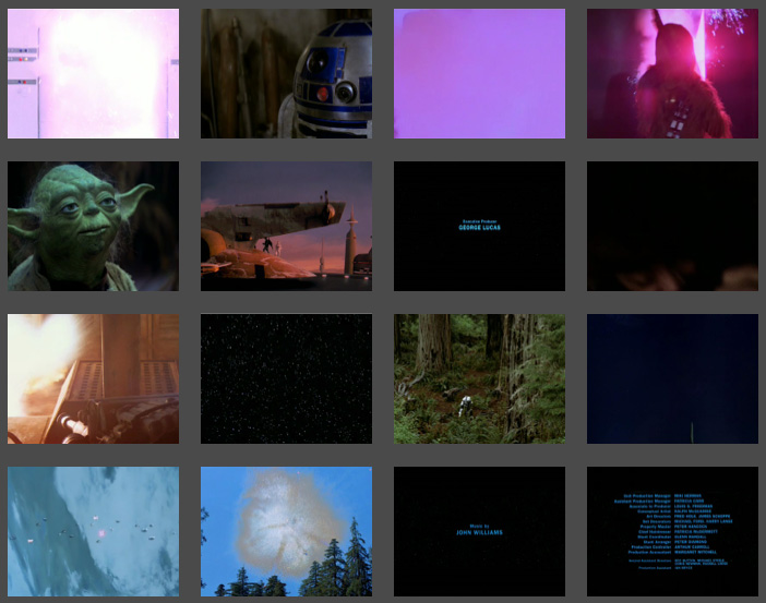
Last week I wrote about using software to scan the original Star Wars trilogy and construct a summary using 16 most surprising, or most telling, frames from the movie. This week, I generated other summaries of different sizes for comparison.
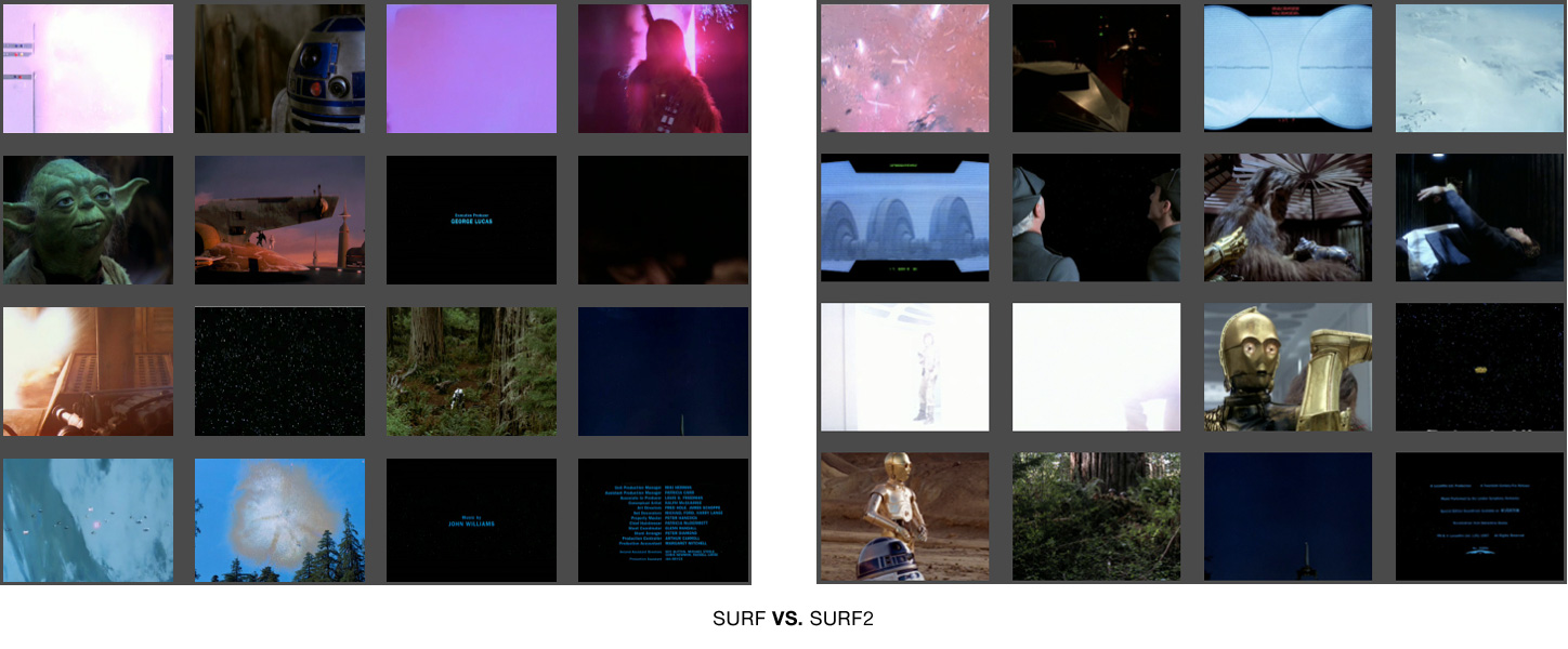
I wanted to make sure I had the best descriptor picked out for this content. I decided to compare the original setting of using SURF (Bag of Words) against SURF2. Both of these techniques use a ‘vocabulary’ file (with ‘words’ describing the images). For SURF, each chosen summary candidate image is compared against a vocabulary made only from the images picked out so far. For SURF2, each picked image is compared to a vocabulary file generated in advanced from all picked candiate images. In other words, SURF is like watching the films for the first time and making a summary as you go. SURF2 is like building a summary after a repeated viewing. Here are the two summaries side by side for comparison:
SURF did a better job summarizing the trilogy. See larger versions of the images here and here and judge for yourself.
Using SURF, I created summaries of other sizes, such as the 3 image summary:

The 3 image summary is not a subset of the 16. However, the 3 image and 4 image summaries share most of their content.
The 4 image summary incorporates most of the content of the 3 image set, but replaces the happy droid couple with the familiar purple door explosion and Luke Skywalker. Note the fact that it grabbed the other yellow text scroll, this time from Episode VI.
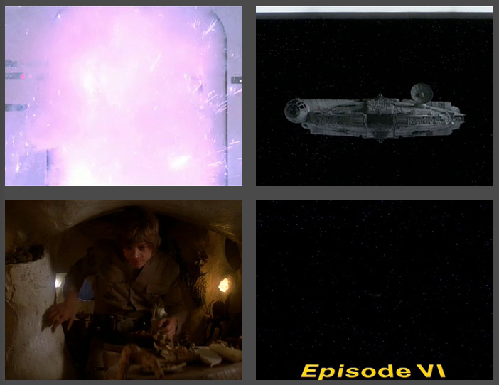
4 Image Summary of Star Wars has most of the content from the 3 image summary, plus Luke and the purple door explosion that precedes Darth Vader's appearance.
The 9 image summary is very rosy. Even though the galaxy-wide party montage was only shown for a few minutes of the final film, these senes take up two frames here (the last ones).
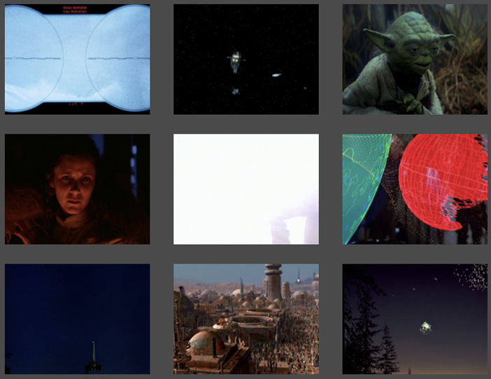
9 Frame Summary of Star Wars shows a pretty rosy story, filled with partying (well, at least for the last two frames!)
The 20 image summary is compositionally interesting but very dark. We see no characters but fire and explosions.
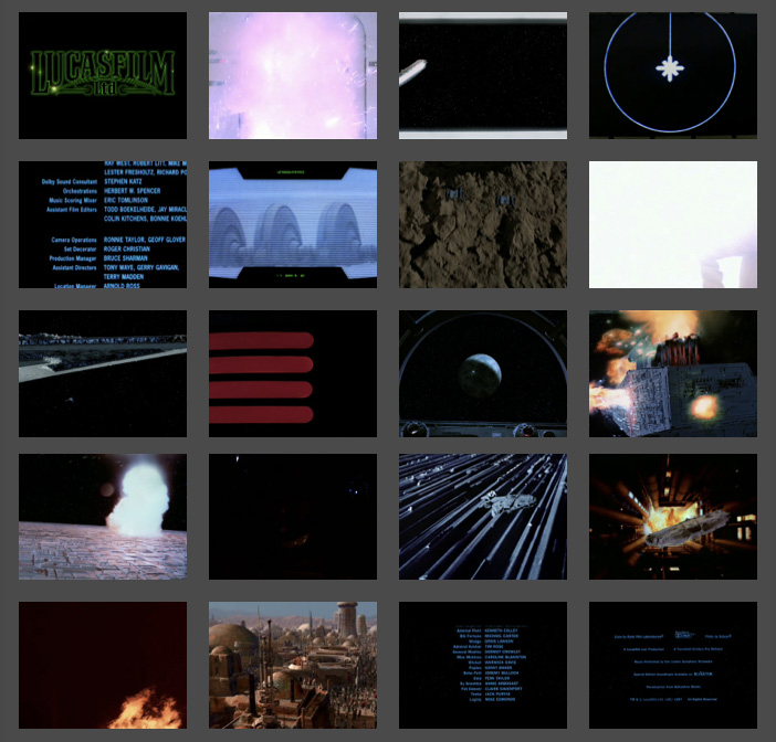
20 Image Summary of Star Wars. A very dark take on Star Wars. Notice the presistent, purple, exploding door. We see no human characters, an explosion, and a fire.
The 40 image summary shows the limitations of this technique. There are way to many (seven!) frames of blue text credits. However, Darth Vader finally makes the cut!

40 Image Summary of Star Wars. Darth Vader finally makes an appearance! We can see the limitations of the summarization technique due in part to the prevalence of blue credit text frames.
A friend pointed out the connection of this work to the work of Jason Savalon. I’m very intrigued by his choies of subjects and by the fine, painterly quality of the processed results. One difference is that my project is rooted in surveillance and augmented decision making, while Mr. Savalon’s projects seem to be geared towards human perception and memory.
Stare Wars: Summing up Star Wars with CV
“We are drowning in information but starved for knowledge.”
—John Naisbitt (Megatrends: Ten New Directions Transforming Our Lives)
I recently started collaborating with a small group of people. We are creating applications based on computer vision algorithms being developed by my friend Yogesh Girdhar.
I used some of this software to scan through my Estonian vacation footage from 2007. The result was a set of images-extracted from the video-that summarized the vacation. I turned hours of footage into a mere 12 stills. Its a more objective summary than I would have made. The software takes into account the entire composition (colors, textures, etc) of the frame, and faces get no special treatment. Matthew Williamson suggested that I use a film everybody knows. I decided to concatenate all three original Star Wars films into one 7 hour movie. The resulting summary of 16 images is here as well as embedded below.
Friends enjoyed me taking them through the summary image by image. It was great to hear them speculate on why the software picked certain frames. Some frames were picked because they were compositionally representative, but others because they were most rare.
Several art projects have questioned/challenge/subvert the supremacy of the surveillance gaze (In the event of Amnesia the city will recall…, Eyes of Laura, Sorting Daemon). Some projects explore the impact of surveillance on our society (Evidence Locker, The Dead Weight of Quarrel Hangs, Wafaa Bilal Domestic Tension). Other projects explore the idea of non-video surveillance (Makrolab, Broken Arrow). It was relevant to question who controls the cameras, but now everyone has access to cameras. Parallel, participatory surveillance creates a participatory panopticon. Despite the initial issues of access to the sensory data, computational constraints quickly become primary. As David Lyon, head of The New Transparency says in Surveillance Society: Monitoring Everyday Life “Today, the most important means of surveillance resides in computer power, which allows connected data to be stored, matched, retried, processed, marketed, and circulated.”
I’m excited about off-loading the difficult decisions about what is deviant to the robots.
leave a comment