SoYummy Lecture Performance at McGill
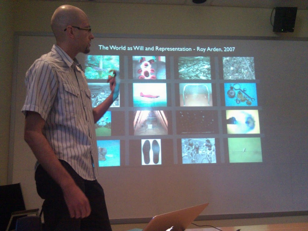
Misha Rabinovich giving the SoYummy lecture performance and showing Roy Arden's The World as Will and Representation SoYummy summary. Photo by Yogesh Girdhar.
On Wednesday, August 3rd, I gave a lecture performance at the robotics building on the McGill campus in Montreal. There was a good audience — both in terms of numbers, energy, and inquisitiveness. I presented research and ideas stemming from my experimentation with computer vision software being developed at McGill. A good amount of the audience was already familiar with the research behind the software, so I had the pleasure of presenting ideas from new perspectives of art theory and philosophy.
According to Charlie Hoban (Educational Technology theorist), the lecture as performance is achievable by only 2% of lecturers and is worth digitizing for the future. Even though the bandwidth limitations for disseminating such lectures he describes will soon seem laughable, I agree that the question of bandwidth is central to this subject. Lecture as performance is an effective information dissemination vehicle because it is so high bandwidth: it combines the visual, aural, gestural, and sometimes tactile and even olfactory senses.
Last year’s curatorial inquiry on the subject at the Museum of Contemporary Art in Belgrade asks “is contemporary art a product of fascination with aesthetic objects or a space of knowledge production?” The most successful art created these days falls into the latter category. It is art that engages the audience in confronting real changes happing in the current world. Contextual Art, as described by Jan Swidzinsky is a particularly attractive approach when presenting to a scientifically minded audience because Contextual Art accepts both art and science as disciplines capable of responding the rapid changes of our technologically accelerated world. From this angle, Lecture as Performance is a post-modern practice because of its emphasis on the communication of information through the melding of pedagogic as well as theatrical approaches (and sits in opposition to Modern Art as art for art’s sake).
Joseph Beuys, who is one of the originators of the Lecture as Performance form (stemming from his ‘Social Sculptures’) wrote that “The most important discussion is epistemological in characterâ€. This is especially true now in our economy of abundance where there is more media being produced than anyone can possibly consume. When the information about our world comes to us in such a fragmented state, from so many different ‘news’ outlets, and filtered by so many layers of special interests, its hard to know what is true and what is bent. Epistemology helps us answer how we know what we know, and Lecture as Performance is an artistic approach to investigating these questions.
Walt Whitman, late in life, lamented that he didn’t tour and read his poetry to the masses to increase his audience. Plenty of examples of artists and scientists disseminating ideas through Lecture as Performance hang in our collective memory. From Tesla’s highly influential demonstrations of radio to Nabokov’s lecture tours through the United States to Laurie Santos’s insightful TED talk on the “monkey economy” and human irrationality we learn of key ideas right from the horse’s mouth. Despite the continuously increasing complexity of the world around us, the old adage of ‘if you can explain it to a 4 year old, you really understand it’ is more true than ever. Lecture as Performance is that ultra-high bandwidth communication channel on which the most relevant truths of today can set sail, powered by nothing more than a person’s breath.
Through the combination of my creative practice and access to the latest cv research (in the form of Yogesh Girdhar’s software) I am able to devise artistic experiments and achieve insight. Through creative application of this research to solve the problems of our economy of abundance we can open new engagements between Art and Science. The impact of Temporal Semantic Compression on Culture will be determined with time and experimenation, and I’m excited to bring the latest insights to interested audiences. The poetic engagements with Art History and Philosophy are more illuminating to the scientific crowd, while explaining the science behind the software is more enlightening to the art audience. The presentation remains accessible for even the most general audience, who is often interested in these subjects and the impact of new technology on their life.
The lecture performance at McGill went really well and I would like to thank Yogesh Girdhar and Gregory Dudek once again for inviting me there. One excellent criticism of the talk was that I didn’t take the opportunity to delve into Lecture as Performance itself: I stayed in character during the question/answer session and didn’t step up to the meta-level. From the Lecture as Performances that I’ve seen personally, it doesn’t seem common for the performer to break out of character during the lecture or even the question/answer portion (if there even is one). One reason this is unclear to me is because the lecture performance itself is not an act: it is honest expression of subjective and objective truths. Thanks to everyone for coming out and being part of the event and I look forward to the next one.
SoYummy hits Subtle Technologies 2011
I just caught up on the sleep I missed during this year’s Subtle Technologies conference in Toronto where Yogesh Girdhar and I did a poster presentation on the SoYummy project. I wanted to do a post about the conference, who I met there, and thoughts on going forward.
The third annual Subtle Technologies festival/conference continued in the Art+Science vein of the previous years. There wasn’t a specific theme this year, but the talks and posters were well enough related to provide a consistent experience. Just because the conference was Art oriented doesn’t mean that all the talks were exciting though. Australian artist Mary Rosengren’s presentation about her collaboration with scientists was too general and at times aggravating while refusing to resolve into a coherent idea at the end. Robyn Moody—who creates fascinating kinetic sculptures related to relevant social topics—was unable to speak about the work in a cohesive way when he wasted 10 whole minutes on an unrelated introduction about the woes of vaccine paranoia.
I experienced several stellar presentations. I wasn’t able to catch all of them, but the scientists Ben Schumacher of Kenyon College and the zany Stephen Morris gave illuminating and engaging talks ranging from the consequences of Eistein’s relativity to patterns in nature. The vibrant Ben Schumacher explained how traveling faster than the speed of light would also mean traveling back in time. Stephen Morris showed how the fascinating formation called The Giant’s Causeway in Ireland was formed and how the same uniform cracking can be repeated at home.
Impassioned presentations by Italian curator Marco Mancuso illuminated larger connections between scientific and artistic research. Two dance related presentations by artists and choreographers Gail Lotenberg and Carl Flink showed innovative collaborations with scientists which resulted in beautiful dance performances captured on video. Jenny Leary’s nuanced advances in magnetic craft techniques traced the trajectory of an artist/inventor.
While some presenters strategically left out specifics, a few did so to their detriment. Riccardo Castagna and Valentina Margaria gave a concise and engaging presentation about their multi-modal Biomatics Virus. The idea itself seemed a bit of a rehash of the Neil Stephenson novel Snowcrash. The music that they generated from a 3D model of the H1N1 virus sounded great though. However, when asked by the audience about their process for converting virus structure data to make the music sound nice, they answered that they did nothing to smooth the raw data, further obscuring the connections between their science and art. Alan Majer’s (of Goodrobot.com) presentation on the other hand was strategically vague in order to open up room for the imagination: how would our society change if we could physically connect our brains together?
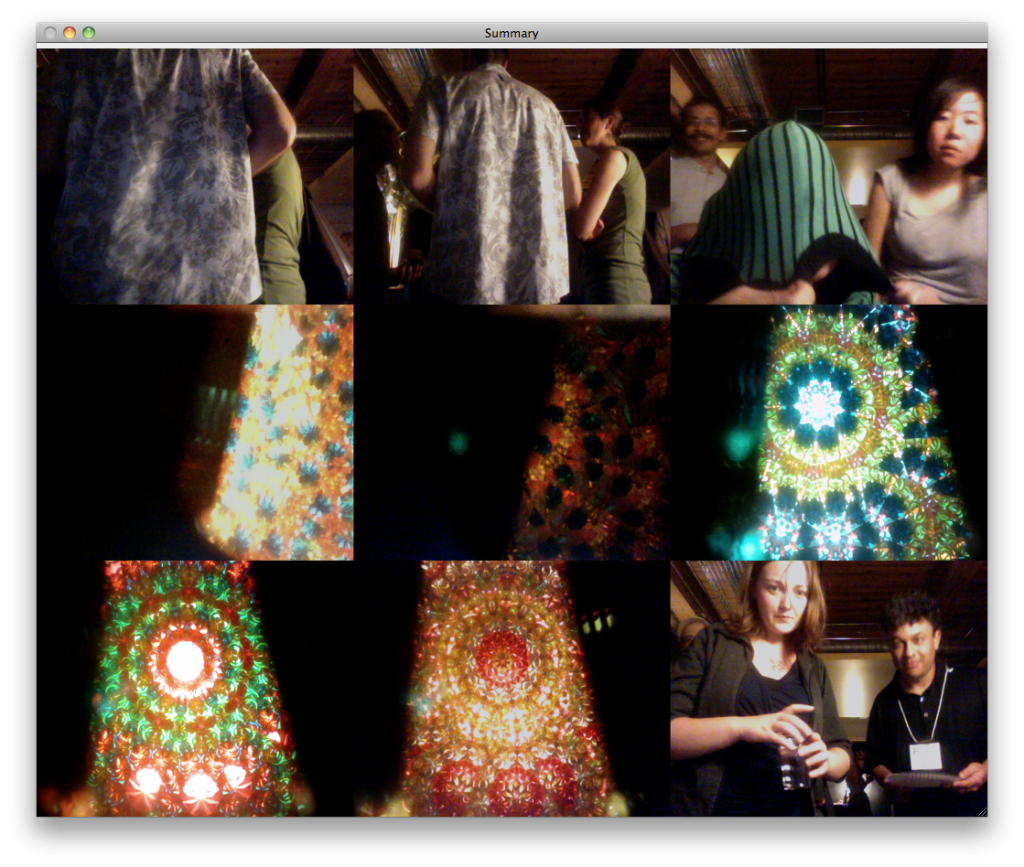
Yogesh Girdhar (aka Yogi) and I got a lot of attention with our poster, especially because we ran a demo of the latest software on a laptop. The software uses open source computer vision libraries to quantify the video coming in. It then uses Yogi’s unique qualification algorithm to decide how surprising an incoming video frame is (compared to what was already seen). If the input is surprising, the still is added into the summary of 9 images. We presented the demo as a contest to excite people to try to surprise the computer and make in into the summary. This was mega fun, and here is the resulting summary of the winners:
Socially I was lucky to meet and hang out with some amazing artists. Ted Hiebert, an artist and educator from University of Washington Bothell, blew our minds with his “plausible impossibilities” and descriptions of his telekinesis contests. Doug Jarvis, an artist-in-residence fellow at the Center for Studies in Religion and Society at University of Victoria BC, described the implications of brain cells in our gastrointestinal tract. I was psyched to meet a key member of the Yes Men: the artist and animator Patrick Lichty. Patrick is creative and generous artist and educator and is now working with Second Life and on cloning William S. Burroughs from a preserved turd. I also enjoyed conversations with Cara-Ann Simpson, Gail Kenning, Eva Kekou, Daryn Bond, Willie LeMaitre, and ginger coons (who gave me a copy of her amazing magazine produced using only free and open source software) among others. The social dynamics culminated with dancing at the party thrown by conference organizer and Director of Programs Jim Ruxton where we set up yet another Surprise Contest. Here is the summary images of the winners:
In conclusion I would like to thank Jennifer Dodd for helping with the logistics and poster curator Lorena Salome for the vital help with the poster. Thanks to Subtle Technologies for having us there. It seems that the talking presentation slots were reserved for those people who’ve taken their project into the world and have documentation of the interactions with other people. I would like to get our project to that level and do a presentation at Subtle Tech next year.
Yummy Faces: Bringing the Synopsis Into the Synopticon

Marina Abramović sat there all day, every day for weeks and just...looked. In some ways she was performing the role of surveillance camera.
More and more of us find ourselves living in the panopticon where the few surveil the many. If we earn the better vision of the future according to David Brin [1], we will all have access to surveillance data. In this possible future, we will each be able to employ what David Lyon [2] and Thomas Mathiesen [3] called the ‘Synopticon’ where the many can watch the few. The first problem in surveillance is always the question of who has access to the data. Eventually, when everyone has the data, the issue of computational power becomes primary so that the data can be sorted/mined. Finally, as the manicured data is delivered, our own perception of the data becomes primary.
As I described previously (here and here), I’m using computer vision software called SoYummy to create synopses (summaries) of videos. The software dissects and categorizes visual data and creates a set of the most interesting still images. The word synopsis itself means ‘seeing together’ and the summaries provide us with the ability to see the whole field of data together in a smaller representation. The concept of ‘seeing together’ at the root of the Synopticon is also essential in balancing state and corporate power: the watchers are themselves watched.
But what are we looking for? Currently, surveillance is mostly used to discover some kind of deviancy. I am intrigued by the inverse: normalcy. Luckily, the distance matrix generating tool that is part of the SoYummy suite compares a set of images and can be used to find the most normal and the most anomalous one. Driving this work are such questions as:
• What rules define and how relative is normalcy?
• What can we learn if we look for the most normal and most unique person?
I decided to use a set of portraits that was already available. I remembered this summer’s performance in NYC by Marina Abramović and the resulting photo portrait archive of the audience. What attracted me to this set is the active gaze of the participants. They are not ambivalent passerbys being caught on camera but are actively looking, even staring, at the artist. Marina herself, sitting almost motionless in the same seat in the gallery all day, every day for weeks, became a surveillance camera. In a way, she was only ingesting views of the visitors, as if it was life-giving sustenance. I harvested the portraits (taking out images of Marina herself) and strung them into a video.
I generated a distance matrix of all the portraits. The result was is a text file with space separated floating point numbers. There are 1490 portraits in the archive. Each image got a distance score to every other image, resulting in 1490^2 = 2226064 values. My Macbook Pro (2.8 GHz Intel Core 2 Due, 4 GB RAM) took days to complete this task. While the computer worked, I asked humans to give me their best guess of who the machine would pick out as the most normal and the most unique looking visitor. What I got was these two people:
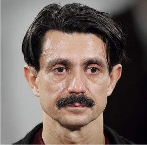
A human picked this image as most 'visually normal' because this man participated and was photographed daily.

A human picked this image as the most visually anomalous because no one else wore a burka in their portrait.
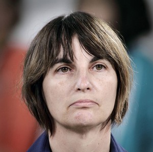
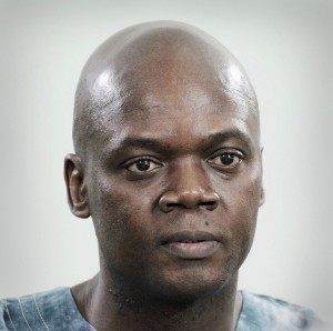
Finally, my computer churned out the distance matrix. I took the average of each portrait’s distance from all the others. Here is the algorithmically picked most normal and most anomalous portraits:
One person in my class who I showed the results too immediately said “Your software is racist”. However, it is important to realize that our starting data set skews the results. I had a studio visit with the satyrical art world institutional critique painter William Pohida soon after this, and I showed him this project. According to him, this summary exposed the demographics of the MoMA audience, telling us more about that institution itself than the individuals.
The next step was clearly to contact Marina and ask her who she remembered the most and compare it to these results. Until I hear from her, I can only imagine that this software gives us some sense about what she remembers from the performance, and perhaps what images permeated her dreams. I wondered if she dreams of one single representative audience member. I decided to generate this epitome of the audience by finding the most normal set of eyes, the most normal nose, and the most normal mouth across all the portraits. I roughly sliced up the images into regions and generated distance matrix comparisons on all the eyes, all the noses, and all the mouths. Here is my approximation of what Marina dreams about now:
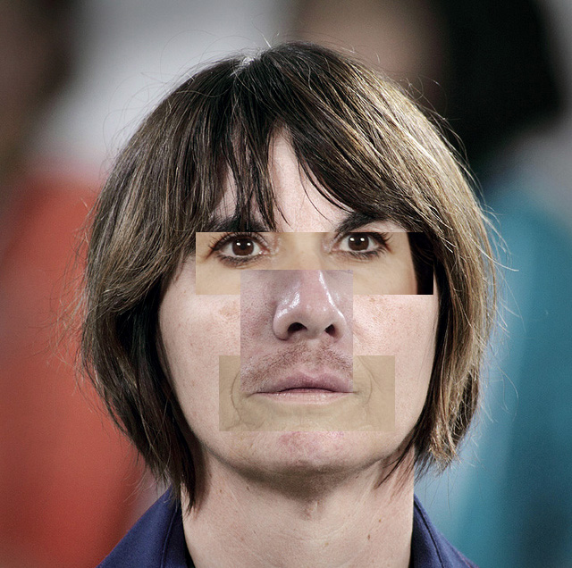
Algorithmically determined 'most normal' gallery goer overlaid with most normal eyes, nose, and mouth harvested across all gallery goers.
What can this exercise tell us about our own dreams? We are constantly barraged by media designed to affect us consciously and subconsciously (such as advertising). It is harder to detect and reason through the subconscious influence because it’s meant to alter our feelings and penetrate to the deeper levels of our psyche. They might even control our dreams. In order to deprogram ourselves from this psychological influence, a deconstruction of our dreams is necessary.
Above is a music video set to Nina Simone’s classic song about summary identity. Summarization software was used to perform social sorting on the actual features of audience participants at MoMA’s The Artist Is Present installation. The most normal facial features were excised and used to create a composited “most normal” portrait.
References:
1. David Brin, The Transparent Society
2. David Lyon, Surveillance after 9/11 available in full here.
3. Thomas Mathiesen, The viewer society: Michel Foucault’s “panopticon†revisited
Marina Abramović vs Nina Simone
I created this video while working on my computer vision surveillance project. I harvested the audience portraits from The Artist Is Present performance this past summer (2010) at the MoMA. I mined this data set for the most normal and most unique looking person (the results are coming the next post). When I strung the images together into a video, I was pretty amazed by the result. When the images are blowing by at a high rate, persistence of vision makes it seem that the individual features of the different people are being substituted. The effect is similar to Michael Jackson’s Black or White music video, but without the explicit morphing.
I also ended up harvesting the eyes, noses, and mouths from these photos and finding the most normal of each. I think Nina Simone’s song I Ain’t Got No (I Got Life) is more ideal in this case, as she really adresses the ‘the whole is more than the sum of its parts’ aspect of our individual identities.
Here is the video (and also its here on its own page with embedding instructions).
Star Wars: Most Boring VS Most Surprising Moments

The x (horizontal) axis is time. Time is skewed to show relative time spent processing summary image candidates for each part of the trilogy. Two summary frames are shown representing the most boring and the most exciting sections. The thin purple vertical lines are most surprising frames kept for the final 40 image summary.
Previously, I showed computer generated summaries of the Star Wars Trilogy. Using data from the last session (40 image summary) I created an info graphic to represent the most boring and the most surprising patches in the Trilogy.
As the software churned on these films, it kept choosing summary images while updating its vocabulary file (used for comparison of the images). In the process, some of these initially picked images were discarded to make room for even more surprising images in the final set of 40. At the end, we ended up with the 40 most surprising images.
Surprise score of an image already in the summary is defined as its distance from other images in the summary. We can define the threshold for picking an image as either the minimum summary score, or the mean summary score.
– Yogesh Girdhar
Some other ways to describe the rules of surprise are:
- Our final kept set of stills are most unlike all other chosen candidate stills.
- We pick the most common and the most rare stills.
- We pick stills such that if we view the picked stills, we won’t be surprised by any of the other stills.
At the end of the 40 image summary run, I had enough data to ballpark where most of the initially picked candidate images came from and also which of them made it into the final summary. In general, it seems that Empire Strikes back Darth Vader fighting scenes are the most surprising to the software, while the first movie contains the least noteworthy patch. This least significant boring section is mostly the middle section of the first movie: robots wandering around in the desert.
Stare Wars: Using the Force (of Surveillance)
Last week I wrote about using software to scan the original Star Wars trilogy and construct a summary using 16 most surprising, or most telling, frames from the movie. This week, I generated other summaries of different sizes for comparison.
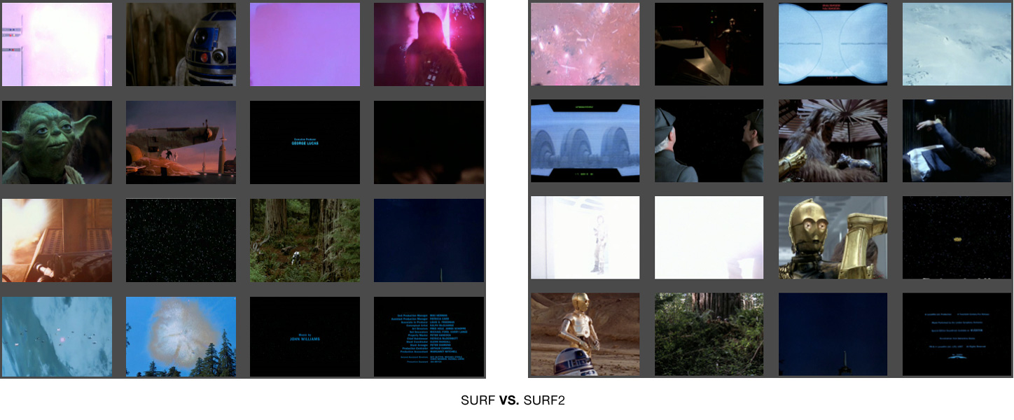
I wanted to make sure I had the best descriptor picked out for this content. I decided to compare the original setting of using SURF (Bag of Words) against SURF2. Both of these techniques use a ‘vocabulary’ file (with ‘words’ describing the images). For SURF, each chosen summary candidate image is compared against a vocabulary made only from the images picked out so far. For SURF2, each picked image is compared to a vocabulary file generated in advanced from all picked candiate images. In other words, SURF is like watching the films for the first time and making a summary as you go. SURF2 is like building a summary after a repeated viewing. Here are the two summaries side by side for comparison:
SURF did a better job summarizing the trilogy. See larger versions of the images here and here and judge for yourself.
Using SURF, I created summaries of other sizes, such as the 3 image summary:

The 3 image summary is not a subset of the 16. However, the 3 image and 4 image summaries share most of their content.
The 4 image summary incorporates most of the content of the 3 image set, but replaces the happy droid couple with the familiar purple door explosion and Luke Skywalker. Note the fact that it grabbed the other yellow text scroll, this time from Episode VI.
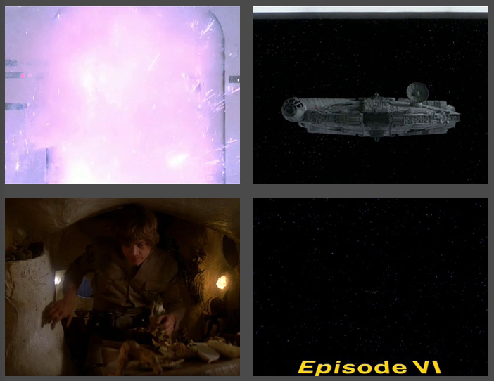
4 Image Summary of Star Wars has most of the content from the 3 image summary, plus Luke and the purple door explosion that precedes Darth Vader's appearance.
The 9 image summary is very rosy. Even though the galaxy-wide party montage was only shown for a few minutes of the final film, these senes take up two frames here (the last ones).
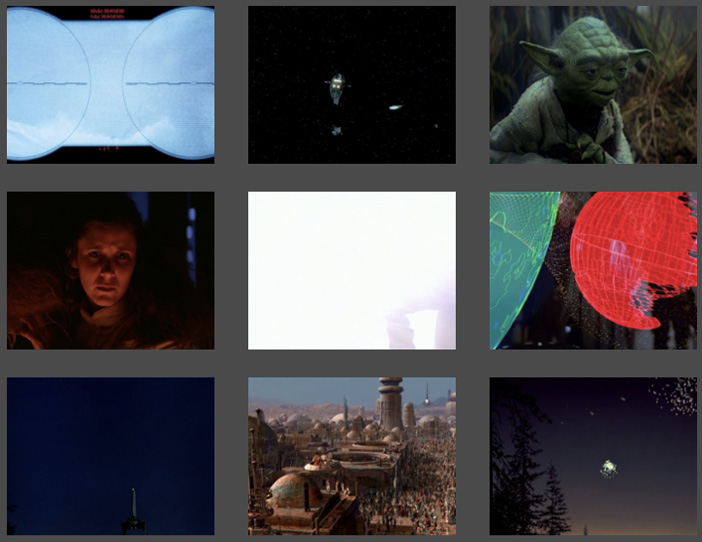
9 Frame Summary of Star Wars shows a pretty rosy story, filled with partying (well, at least for the last two frames!)
The 20 image summary is compositionally interesting but very dark. We see no characters but fire and explosions.
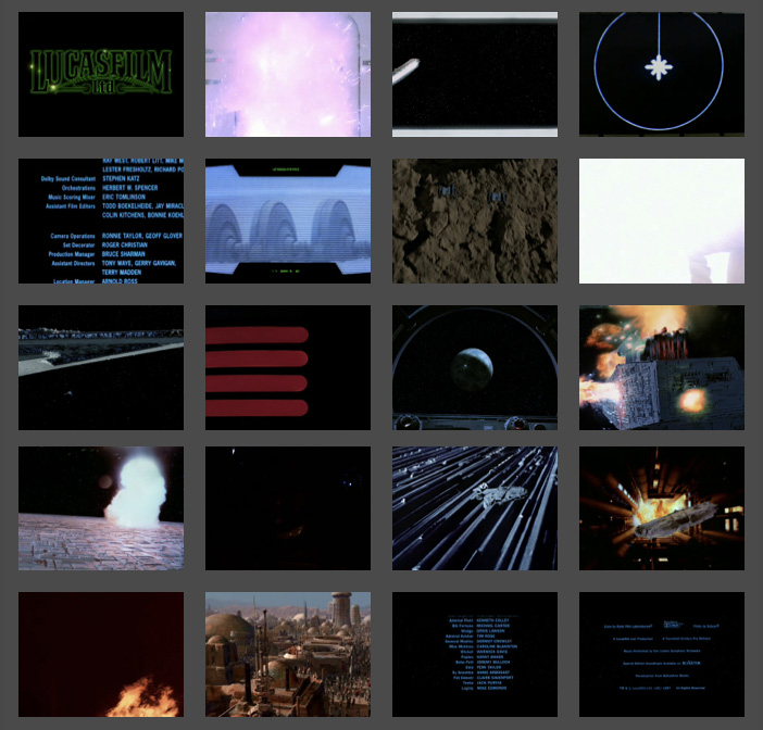
20 Image Summary of Star Wars. A very dark take on Star Wars. Notice the presistent, purple, exploding door. We see no human characters, an explosion, and a fire.
The 40 image summary shows the limitations of this technique. There are way to many (seven!) frames of blue text credits. However, Darth Vader finally makes the cut!

40 Image Summary of Star Wars. Darth Vader finally makes an appearance! We can see the limitations of the summarization technique due in part to the prevalence of blue credit text frames.
A friend pointed out the connection of this work to the work of Jason Savalon. I’m very intrigued by his choies of subjects and by the fine, painterly quality of the processed results. One difference is that my project is rooted in surveillance and augmented decision making, while Mr. Savalon’s projects seem to be geared towards human perception and memory.
Stare Wars: Summing up Star Wars with CV
“We are drowning in information but starved for knowledge.”
—John Naisbitt (Megatrends: Ten New Directions Transforming Our Lives)
I recently started collaborating with a small group of people. We are creating applications based on computer vision algorithms being developed by my friend Yogesh Girdhar.
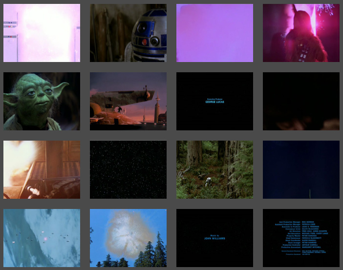
I used some of this software to scan through my Estonian vacation footage from 2007. The result was a set of images-extracted from the video-that summarized the vacation. I turned hours of footage into a mere 12 stills. Its a more objective summary than I would have made. The software takes into account the entire composition (colors, textures, etc) of the frame, and faces get no special treatment. Matthew Williamson suggested that I use a film everybody knows. I decided to concatenate all three original Star Wars films into one 7 hour movie. The resulting summary of 16 images is here as well as embedded below.
Friends enjoyed me taking them through the summary image by image. It was great to hear them speculate on why the software picked certain frames. Some frames were picked because they were compositionally representative, but others because they were most rare.
Several art projects have questioned/challenge/subvert the supremacy of the surveillance gaze (In the event of Amnesia the city will recall…, Eyes of Laura, Sorting Daemon). Some projects explore the impact of surveillance on our society (Evidence Locker, The Dead Weight of Quarrel Hangs, Wafaa Bilal Domestic Tension). Other projects explore the idea of non-video surveillance (Makrolab, Broken Arrow). It was relevant to question who controls the cameras, but now everyone has access to cameras. Parallel, participatory surveillance creates a participatory panopticon. Despite the initial issues of access to the sensory data, computational constraints quickly become primary. As David Lyon, head of The New Transparency says in Surveillance Society: Monitoring Everyday Life “Today, the most important means of surveillance resides in computer power, which allows connected data to be stored, matched, retried, processed, marketed, and circulated.”
I’m excited about off-loading the difficult decisions about what is deviant to the robots.


leave a comment